People plan in all kinds of ways, from sticky notes and spreadsheets to shared docs and elaborate task lists. But most of these traditional methods still rely heavily on text. They show what needs to be done, but not how it all connects.
That’s where visual planning changes the game. By translating plans into intuitive visuals like charts, boards, and maps, teams can literally see how work flows, how resources align, and where the roadblocks lie.
For modern organizations that depend on real-time clarity, visual planning is fast becoming the backbone of smart execution. Especially when powered by a robust resource planner software like eResource Scheduler (eRS), which merges planning precision with visual simplicity.
This guide breaks down what visual planning is, the tools behind it, and the powerful benefits driving its rise.
Visual planning is a strategy-driven way of managing projects and resources using charts, boards, timelines, and graphics. Instead of relying on pages of lists and notes, it turns data into a visual story of progress, priorities, and interdependencies.
A project manager can instantly see how multiple moving parts connect, which tasks depend on others, who’s available, and where timelines overlap. The result? Fewer surprises, better allocation, and smoother execution.
To understand visual management in practice, it helps to know its core tools. Each of these serves a unique purpose and adds a different layer of clarity.
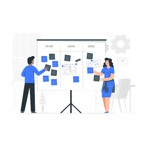
Kanban and Scrum boards give teams a living, breathing view of their workflow. Each task sits in one of three key columns—To Do, In Progress, or Completed—represented by color-coded sticky notes or cards.
With a quick glance, project managers can track progress, spot delays, and rebalance workloads. Digital versions (like those within eRS) even let users drag, drop, and reassign work instantly, syncing updates across teams in real time.
The classic yet ever-powerful Gantt chart remains a favorite among planners. It’s a horizontal bar chart that visualizes project tasks, start and end dates, dependencies, and milestones.
Advanced Gantt charts, such as those built into eRS, go a step further by displaying resource allocations, making it clear who’s handling what and whether workloads are balanced.
They are ideal when:
A Gantt chart offers both macro and micro visibility from overall project progress down to daily resource activity.
Mind maps, often visualized as branching diagrams or storyboards, are perfect for brainstorming and structuring ideas. They map the central concept in the middle and radiate out with connected subtopics, tasks, and dependencies.
This visual technique is best used for:
Mind maps ensure that while creativity flows freely, structure never gets lost.
Timelines give a linear view of project flow, showing what comes first, what overlaps, and when deliverables are due. Simple yet powerful, they help track dependencies and keep everyone aligned with the bigger picture.
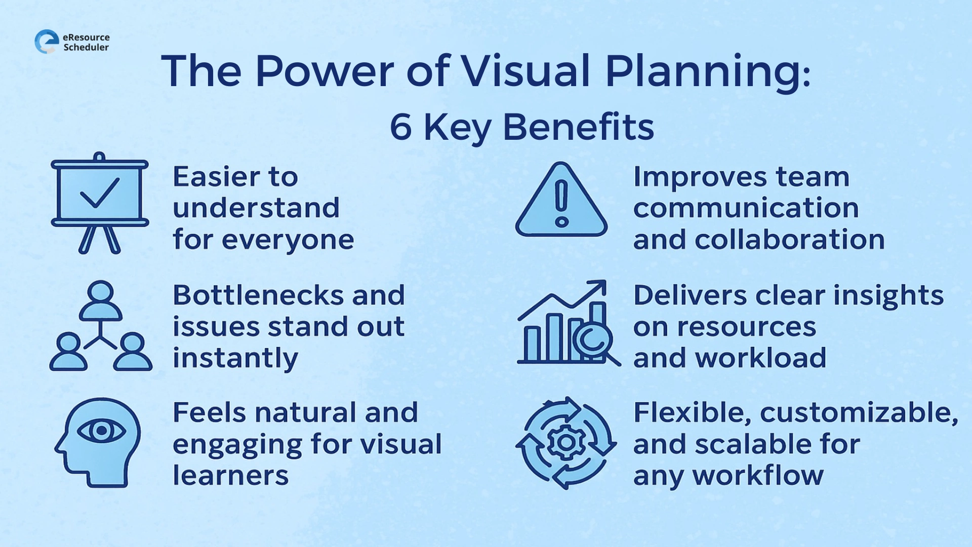
So, why is visual planning gaining so much traction? Because it bridges strategy, communication, and execution seamlessly. Here’s how it helps teams plan and deliver better:
Visuals cut through complexity. Instead of sifting through rows of data, stakeholders can look at a single dashboard or chart and instantly see what’s on track, delayed, or overbooked. Managers save hours of reporting time, while teams gain real-time clarity.
It’s a universal language for progress: quick, transparent, and precise.
When tasks are visually mapped, problem areas become obvious. If a task stays stuck in the In Progress column too long or one team member’s workload seems overloaded, the system flags it before it becomes a full-blown issue.
This proactive view lets managers balance workloads, reassign resources, and fix delays early, a key advantage of integrating visual tools within allocation software like eRS.
Visual planning turns abstract data into shared understanding. Team members can literally “see” how their work connects with others, promoting cross-functional alignment and faster decision-making.
Modern visual tools like Gantt charts and Kanban boards also enable live collaboration. Teams can edit, comment, or update progress in real time, wherever they are. Goodbye, endless email threads.
With a well-designed visual planner, understanding resource utilization takes seconds. A quick glance shows who’s busy, who’s available, and which tasks are running behind. Overloaded columns or prolonged task durations can signal burnout or process inefficiencies.
Over time, this data reveals patterns, average task durations, peak workloads, and bottleneck areas, helping leaders refine allocation strategies and plan capacity with precision.
Around 65% of people are visual learners. That makes visual planning not just efficient but intuitive. Colors, shapes, and charts keep information digestible and engagement high.
In a Gantt chart, for example, bars change color as tasks complete, creating a dynamic progress view. The visual feedback loop keeps motivation up and confusion down, turning dry task tracking into an interactive experience.
Visual planning tools can adapt to fit virtually any workflow. Kanban boards can have custom columns, fields, and color codes. Gantt charts can track dependencies, resources, and deliverables. Whether it’s a small team project or an enterprise-wide initiative, visual tools scale effortlessly.
Software like eRS takes this flexibility further, integrating visual dashboards with real-time resource data to create a unified, scalable system that grows with your business.
Modern teams face tighter deadlines, hybrid work challenges, and complex resource dependencies. In this environment, clarity is no longer optional.
Visual planning offers that clarity by merging data, design, and decision-making into one coherent system. It aligns teams, minimizes miscommunication, and helps leaders allocate intelligently, all without losing sight of the big picture.
That’s why tools like eResource Scheduler have become indispensable for forward-thinking organizations. It combines the best of resource planner software and allocation intelligence, letting teams plan smarter, visualize workloads, and forecast capacity with confidence.
Visual planning isn’t just about pretty charts; it’s about transforming how teams think, plan, and execute. It brings alignment where there’s confusion and foresight where there’s chaos. If your team still runs on spreadsheets or static planners, it’s time to see what true visibility looks like.
eResource Scheduler (eRS) makes visual planning effortless. From drag-and-drop Gantt charts to color-coded dashboards and capacity heatmaps, it gives you a full picture of your projects, resources, and timelines all in one place.
So stop managing in the dark. Book a quick demo of eResource Scheduler today and watch how visual planning can transform your project delivery from reactive to remarkable.
1. What is visual planning in project management?
Visual planning uses charts, boards, and graphics to map out projects, making it easier to track tasks, dependencies, and resource allocation visually.
2. How does visual planning improve team productivity?
It helps teams see priorities, progress, and roadblocks at a glance, reducing confusion, improving communication, and accelerating decision-making.
3. What tools are best for visual planning?
Popular tools include Kanban boards, Gantt charts, mind maps, and timelines. Advanced resource planner software like eResource Scheduler integrates all of these in one place.
4. How is visual planning connected to resource allocation?
By showing workloads and dependencies visually, managers can identify overbooked or underutilized team members, ensuring balanced allocation and smoother delivery.
5. Can visual planning scale for large organizations?
Absolutely. Enterprise tools like eRS offer customizable dashboards, scalable workflows, and real-time collaboration suited for both small teams and global enterprises.


Plan Smarter. Schedule Faster. For Free.
Join thousands already using eResource Scheduler to align teams, time, and tasks seamlessly.
 ALL FEATURES INCLUDED